


Make the next step obvious before polishing the next screen. A useful app design review starts with a person trying to finish a job: choose a service, find a project, correct a mistake. Check whether the interface explains that job, makes the important information readable, and gives the person a clear way forward.
You can do this with an existing app. Keep the editable design-review worksheet beside it and record what you observe. Separate a problem visible in a screenshot from behavior you have actually tried. A good-looking button does not establish that its action works.
Start with one person and one task
Write a sentence that ends in an observable result. For a booking app: “A returning customer chooses a haircut and can check its price and duration before selecting a time.” For a project portal: “A homeowner finds their project and understands its current phase.”
Keep unrelated tasks out of the first pass. Booking, changing an appointment and managing staff schedules deserve their own checks. Mixing them together makes every control seem equally important.
Choose a starting state and an ending state. Note whether you are signed out, using a demo, or working in an authorized test account. That context affects what the person should be able to see. Use fictional records and avoid exposing customer information in screenshots.
Make the decision easy to scan
Bookslot gives us a concrete service-selection screen to inspect. Its September 9, 2026 capture shows six service cards. Each groups a service name with a price, duration and short description. “Classic cut” shows $28 and 30 minutes; these are sample business details, not a current offer from your business.
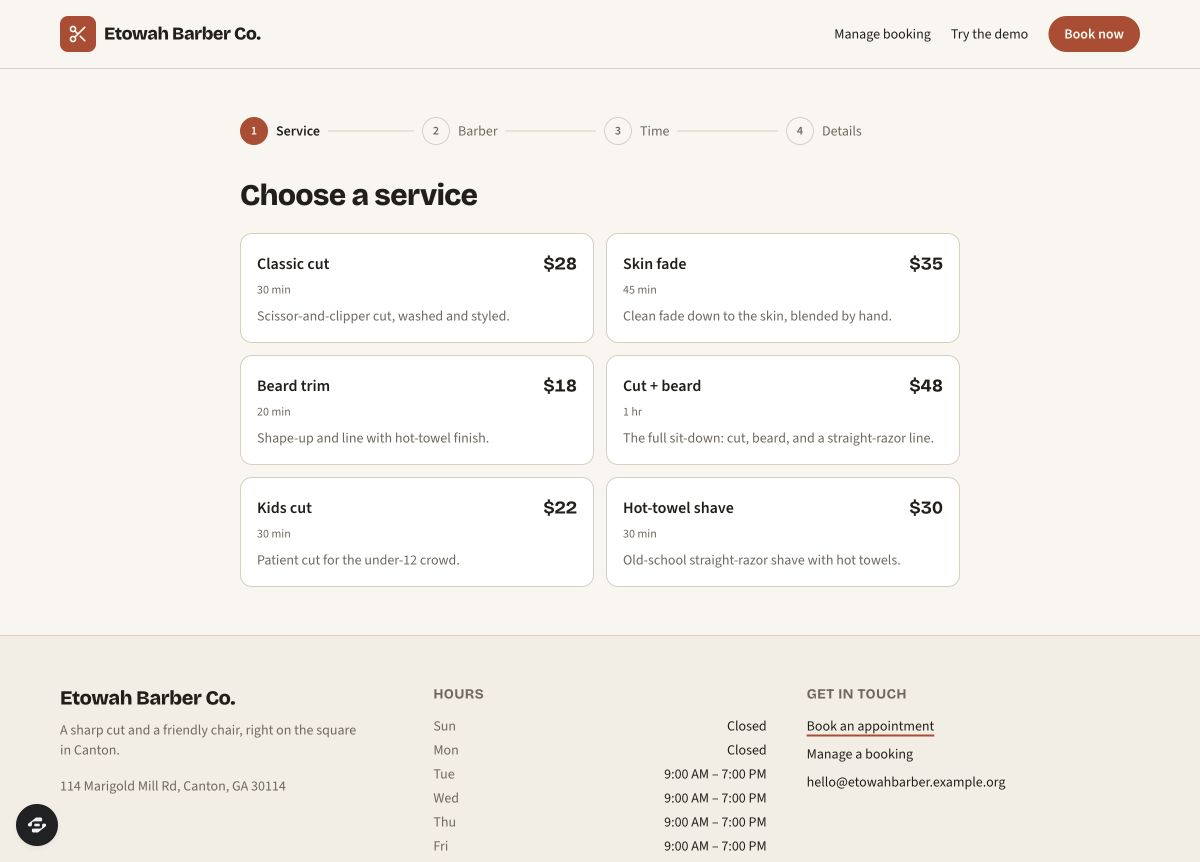
Bookslot’s public preview, captured September 9, 2026. Read the grouping and progress labels; this screenshot alone does not establish keyboard behavior or booking reliability.
Open full-size imageThe heading says “Choose a service.” Above it, Service, Barber, Time and Details show the sequence. Someone can inspect the current decision and see what follows without reading a long explanation. That grouping is a useful pattern to borrow.
Review your own screen with three questions: What am I choosing? What information changes that choice? Where do I go afterward? Put the information needed for the decision close to the action. If price changes with an option, show that relationship where the option is chosen.
For a product catalog, use the variant-filter playground to check whether one variant actually matches the shopper's choices. Its worked examples separate matching products, matching variants and the cards visible on one page.
Then try the cards. Can keyboard users reach them? Is the selected service visibly identified? Does the next screen retain the choice? The screenshot cannot answer those questions. The existing booking walkthrough reached an unsent details form; confirmation, saved appointments and conflict handling remain separate tests.
Give status labels a clear meaning
Quarry illustrates another arrangement: a renovation board with Planning, Demo, Rough-in, Finish and Complete columns. The September 8, 2026 capture groups illustrative project cards beneath those headings. Cards include text statuses such as “Estimate sent,” “Active” and “Closed,” alongside color accents.
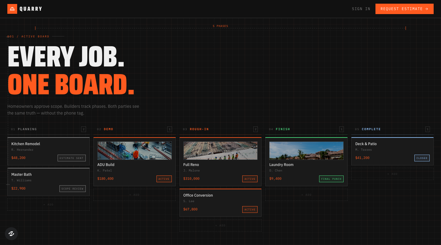
Quarry’s public board, captured September 8, 2026. The phase labels show a progression using illustrative projects; test your own mobile layout and private access separately.
Open full-size imageThe visible phases help explain progression. But a label familiar to a builder may puzzle a homeowner: here, “Demo” appears in a renovation sequence, where a reader may need “Demolition” spelled out. Treat that as a question for your intended users, not proof that the existing app confused them.
For your board, write what each phase means and who can move a record into it. Distinguish the phase from the next action. “Scope review” describes a state; “Review the proposed scope” describes something a person can do.
For a partner statement, trace each line to its payment evidence before choosing a paid badge. The fictional exercise separates approved, processing, settled and unknown evidence, with partner-only statement access and operator-only source records.
For a field-service workflow, the field-visit completion example distinguishes assigned, attempted and completed work with required observations and an owned follow-up for a blocked visit.
Keep a text label wherever color carries meaning. Also decide what happens when a project is overdue, paused or missing information. Those conditions should be understandable without memorizing a color key. Quarry's screenshot does not establish private access, approval or payment behavior; the client-portal guide explains how to test those boundaries separately.
The exception-dashboard example turns overdue, waiting and unassigned jobs into explicit rules. Its twelve-job dataset shows why three cards can contain eleven flags but only seven distinct jobs, and how one completed job changes every affected count.
Read the interface in both themes
Inspect the rendered page, not just the theme menu's label. Choose Light, then Dark, and read the same heading, description, form label, link, disabled control and error message. Check each foreground against its actual background. A color that reads clearly on a dark card may disappear on a pale one.
Use a contrast checker for doubtful combinations and record the foreground and background pair. Size, weight and surrounding content also affect reading. Keep supporting text legible, and make links recognizable before someone hovers over them. An underline can distinguish a link from the sentence around it.
After choosing a theme, reload and follow a link to another page. Record whether the page and selected theme still agree. If they do not, describe the exact transition. “Light selected, article still dark after navigation” is a useful report; “the theme is broken” leaves the next person guessing.
Record the theme, exact control and transition in the worksheet so someone can repeat the check.
Check the next action on a phone
Open the same task on a phone-sized screen. Read it at a comfortable size before zooming. A desktop board may need horizontal scrolling inside the board, while the page's navigation and main action should remain easy to reach.
Follow a real sequence rather than judging the first view. Open the menu, select an option, enter a longer sample name and correct it. Check that instructions, validation messages and the action button stay visible when the keyboard is open. Do not hide essential information just to make the screenshot look tidy.
Also use Tab, Shift+Tab, Enter and Escape where appropriate. You should be able to see the focused control and leave an opened menu without losing your place. Look for actions that appear only on hover; a touch user needs another way to reach them.
Ask someone unfamiliar with the screen to try the task without coaching. Record where they pause and what they expected. Use that observation to choose the next change; gather more evidence before estimating how many people it affects.
Turn observations into a small change request
Choose the issue that most directly interrupts the task. State the current behavior, the desired change and how you will check it. For example:
On the service screen, keep the service name, duration and price together.
Make the selected service distinguishable with text or an icon as well as color.
After selection, show that service on the next screen.
Let the customer go back and change it without re-entering unrelated details.
Check the complete sequence with keyboard input and on a phone.
Report any behavior that remains untested.
This is a proposed requirement, not a claim that Bookslot currently fails it. Change one meaningful part, then repeat the original task. Confirm that improving the layout did not remove useful information or break the next step.
Use the worksheet to keep the evidence and unresolved checks together. If either example fits your needs, inspect the Bookslot remix page or Quarry remix page. Creating a copy continues through account and access checks; review plans and credits. Bring your specific change request into the builder, then test your own copy before inviting customers.